Saturday, January 24, 2009

Distressed Murals Westin Hotel

Framed artificially distressed mural with European themes

Framed and illuminated artificially distressed mural with European them, real distress reveals plywood underboard
Close up of plywood under board peeking through fake distressed mural with European themePhotographed on 24 January 2009

Long before Disney brought pure Teutonic evil to Times Square, driving away before its fury all that was good and decent from the neighborhood, an evil mastermind, Ernest W. Hahn, turned Horton Plaza from Hippie paradise where young swain hustlers could ply their trade and romance was a mere descent down the magical stairs to the underground "facilities", into a ghoulish monument to corporate sterility where one might find such "murals" as these.

For the connoisseur of the tacky these murals on the Westin Hotel in the Horton Plaza are an embarrassment of riches. Imagine a scholar who spent his life dedicated to study and documentation of tackiness in America. After decades of roaming the nation cataloging various displays of tackiness our weary traveler could gaze upon these murals and die safe in the knowledge that their mission had been complete, the Holy of Grail of tackiness so perfect that by its very existence proves the existence of a deity who can bring forth a work of tackiness far beyond the meager efforts of mortal man.

I will go through the various elements of these murals which meet the definition of tackiness. To be truly tacky a work must have been commissioned by an entity of wealth and power. These murals grace the Westin Hotel untold millions were spent on its construction and appointments. True tackiness is inexplicable. Tacky for Tackiness sake unjustified by the slightest hint of style or purpose. These murals are European scenes with artificial distress. The architecture Horton Plaza and the outside of the hotel might generously be referred to as modernist adobe. It is though it was designed by Hitler after he had been given LSD and read random passages from mediocre magical realist writers. The interior of the Hotel is decorated in what one might high McDesign which gives one the general sense of being expensive without any threat of quality, character, or originality.

How does a distressed European mural find its way to San Diego, and why would one put it a hideous orange insult to Native American culture? Why--it just refuses to even try to make sense. The fact that at the bottom of one of the murals there is real distress which shows that the "mural" was actually applied to plywood, that Velveta cheese product of woodlike material which must be hideous doom of trees who lived immoral lives. But the pièce de résistance is of course the fact that this monument to all that is tacky is lit, so that one may behold its Polaroid Picture of Perfection during the night time. Believe it or not these murals are not the tackiest element of the Hotel. Keep checking, to see what can possible top this.

The information for the Westin Hotel is as follows. Be sure to book several days, these masterpieces can not be fully enjoyed over just one day's viewing.

The Westin Gaslamp Quarter, San Diego
910 Broadway Circle
San Diego, California 92101
Phone: (619) 239-2200
Fax: (619) 239-0509
email


Saturday, January 17, 2009

Fifth and Market

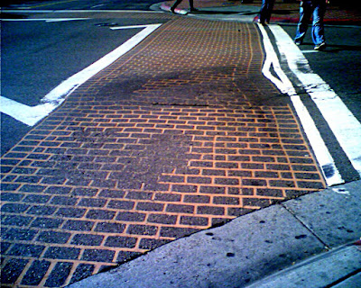
Picture of Brick effect crosswalk at the intersection of Fifth and Market.  The fake bricks have partially worn off.
Picture of tacky yellow brick effect at the intersection of Fifth and MarketPictures taken 16 January 2009
San Diego is in the heart of Southern California's no tax no matter what zone. Like the The Beatles who wrote Taxman upon discovering that wealthy men they would be imposed upon by taxes, the nouveau riche of Southern California were absolutely aghast to find that their new found fortune invited visits from the revenuers. San Diego is home to fire ravished communities who resolutely refuse to pay for fire services and then had the nerve to complain that Red Cross as is their custom used some of the surplus from a campaign after one of the frequent fires to use for other purposes. San Diego voters would literally rather watch their family members be consumed by a wildfire than pay taxes. If San Diego had put on Royal Wedding H.R.H the Prince of Wales and the Lady Diana Spencer, the first part might have been the same but they would have held the reception in a parking lot of Burger King. A true San Diego resident can come close to taste, but in the end will always cheese out at the last moment.

Pictorial evidence of this truth is above. At the heart of the Gaslamp center is one of those fancy intersections invented in New York but famously common in Tokyo where pedestrians can cross in all directions. This has four "brick" effect cross walks and in the center the same effect in the as well as the words Gaslamp quarter. As you can see from photos, the effect, which was plenty cheesy to begin with, shortly became distorted and rubbed off. Like so much of San Diego tackiness it is also senseless. Real brick may be expensive to install but it is much cheaper over the long haul than asphalt. As cheesy as this is in itself. It is only one of several cheesy elements that can be observed at this intersection. The others will be the subject of future posts. So, remember, when you chose a wedding planner, make sure she has never lived in San Diego.


Tuesday, January 13, 2009

CityFront Terrace Sign

Picture Taken 10 January 2009
Unfortunately, like with much of San Diego tackiness, it is almost impossible to capture the true tackiness of this sign. In the picture it looks as if it has some sort of "Brassy" letters on a white background. This would certainly be tacky enough for an upscale condo building. As I know only too well real brass requires cleaning once a day at minimum. In an urban area such as San Diego it requires cleaning twice a day. What ever the letters and logo are they are not real brass exposed to the elements. And, in person they look appropriately cheesy.

The far greater offense however is that the background is not in fact white but a light green. It seems as if this is supposed to be some sort of bronze with patina, uncleaned brass in San Diego would be a dark splotchy black. But whatever it is supposed to be, it is not that. One the easiest paths to Takyland is to pretend to be something your not. I can understand the desire to have the sign be what it pretends to be. Condos in this area are old converted warehouses. One might think that history would be appealing. But in reality the developers where having to contend with a neighborhood that had a quite scuzzy reputation. Thus, everything about this building is an attempt not only to project a posh environment, but slyly imply it was always thus. But once they realized that they were not going to be able to have the sign be "real," they should have ditched the idea and gone with something else. This particular sign can be viewed from the Martin Luther King, Jr. Promenade. The information for the condos follows:

CityFront Terrace
Phone: (619) 702-7729
Fax: (619) 702-7801
Email: cm@cityfrontterrace.org
Front Desk: (619) 702-9110
Office: CityFront Terrace HOA
500 W. Harbor Drive
San Diego, CA 92101